Make the next step clear.
Lead with the product, the file or the action. Let the interface explain what to do without a long sales pitch.
DENTAL PRINT CO. / DESIGN STANDARD 1.13
The governing brand and interface guide for Dental Print Co.
One connected system, from the first impression to the customer’s next order.
01 / GOVERNANCE
Design revisions apply across the whole customer experience, in the same pass.
Lead with the product, the file or the action. Let the interface explain what to do without a long sales pitch.
Orderly type and spacing, useful product information and honest descriptions of the workflow.
Use plain language and leave a direct path to the team when the answer needs a conversation.
02 / COLOR
White, near-black, cobalt and light gray keep the page quiet. Dark selected states and solid form surfaces preserve clear decisions.
#2046E8Primary actions, links and emphasis
--dpc-blue#101113Headings, reading text and dark panels
--dpc-ink#FFFFFFMain canvas and reverse text
--dpc-paper#F3F4F6Secondary light-gray grouping; retained compatibility token
--dpc-mineral#F3F4F6Grouped customer content
--dpc-wash#565B65Supporting text and descriptions
--dpc-muted#D6D9DFDividers and component boundaries
--dpc-line#131C3ESelected product rows and order/account context
80% ink + 20% cobalt#1D3BBDControlled cobalt depth for focused states
80% cobalt + 20% ink#C7D1F9Readable reverse accents on dark context
75% paper + 25% cobalt#F2F4FEQuiet cool grouping where needed
94% paper + 6% cobaltUse: white as the canvas, near-black reading text, light-gray grouping and cobalt actions. Use white light-actions on dark surfaces. Derived tones remain available for selected states and order context.
Avoid: unrelated accent colors, competing primary actions, ornamental gradients and color-only status indicators.
Text contrast: ink/paper 18.89:1; cobalt/paper 6.77:1; secondary/paper 6.82:1. Shared brand settings enforce the project target of 6:1 for active text pairs and 9:1 between ink/paper focus colors. WCAG AA requires 4.5:1 for normal text; this project deliberately keeps more headroom.
03 / TYPOGRAPHY
You design.
We print.
Use the display role for the homepage, page titles for public interiors, and the section role for compact ordering and account headings. Component titles, reading copy and controls remain consistent throughout.
Use sentence case, open body leading, and tabular numbers for prices and order data. Utility labels use the same family. Inputs remain at the body role for readable phone entry.
clamp(3.5rem, 7.2vw, 6.75rem) / 750 / 0.96clamp(2.75rem, 5.5vw, 5rem) / 750 / 1.02clamp(2rem, 3.6vw, 3rem) / 750 / 1.081.5rem / 650 / 1.2clamp(1.125rem, 1.5vw, 1.25rem) / 400 / 1.61rem / 400 / 1.650.875rem / 400 / 1.550.75rem / 600 / 1.5clamp(2rem, 3vw, 2.5rem) / 650 / 1.15These are the actual shared role definitions used by the site, scaled by the current 100% brand setting. Inter is served locally. New one-off font sizes require a documented role and a site-wide review.
A typographic wordmark based on the supplied direction. Keep the cobalt period, preserve the horizontal arrangement, and leave at least one capital-letter height of clear space. The full company name remains The Dental Printing Company. Preserve any later supplied master logo.
04 / COMPONENTS & GEOMETRY
The same shapes, labels, spacing and states apply to marketing and customer pages.
Softly rectangular buttons with 14px corners. Primary actions are 52px high; the prominent hero action is 60px with body-role text, also used for the closing action. Compact and native customer controls are at least 48px. Use one ordering goal per group. Cobalt on light surfaces; white on dark surfaces. All use the shared action corners.
Body-sized input text, 10px corners, 8px label gaps, 24px native form-row gaps and explicit optional fields. Keep errors near the affected control and preserve entered values.
This example is not submitted or saved.
Shared 18px panel corners, fine rules and 8px-based spacing. Use 24px gaps between related items, larger space between ideas, and no decorative shadows.
PRODUCT DETAILTags use 6px corners. Navigation and tabs use the same restrained rectangular language.
Two-color ink/paper keyboard focus, readable foreground/surface pairs and meaningful text alongside status color. Respect reduced motion. Make loading, validation and empty states as deliberate as the populated page.
Ready to submit with the order. Selection is separate from upload or any mesh/clinical review.
Layout: 1280px maximum content width, shared 20/32/56px responsive gutters, and a shared section-spacing scale. Reading columns stay comfortable inside the wider page grid.
Retired: pill actions, fully rounded navigation chips, mixed heading families, isolated font-size overrides and dense decorative dashboard previews.
CONSISTENCY / FIVE REFINEMENT PASSES
Targets are project guardrails, not a full accessibility certification. Review actual surfaces, selection/validation states and keyboard focus. WCAG excludes inactive controls and decorative boundaries from its contrast requirements; keep their purpose distinct.
Reference: W3C text contrast, meaningful control contrast and two-color focus indicators.
05 / IMAGERY & HOMEPAGE
Actual catalog photography on plain surfaces. Interim hero imagery stays tied to the two real product families.

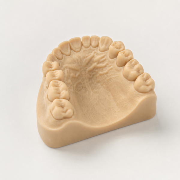
People, lab interiors, printer hardware, beige surfaces and decorative arch/CAD backgrounds are retired from the active theme. Earlier designs are archived privately; retained source assets remain available for recovery. Final owner imagery, exact reference copy, file-first ordering and business claims remain separate inputs.
06 / VOICE
“Start an order.” “Choose a model.” “Review your order.” Use direct verbs and explain the next step.
Use current product data. Publish prices, materials, turnaround and production stages only when supported by actual operations.
Material-specific fit values, adjustment instructions and downloadable CAD profiles require validation before publication.
07 / DECISION & CHECKOUT
Clarity, contrast and useful reassurance support the next decision.
Name splints and models in one short explanation. Keep prices in the dedicated pricing area and ordering decisions, not in the hero.
Start an order opens the existing product selector. Upload-led wording requires a separately resolved file-first flow.
Use current catalog photographs as interim hero assets. Preserve an accurate model range and do not imply distinct verified variant photography.
Keep the primary action visible at the reviewed desktop and phone sizes. Remove repeated labels and unnecessary supporting copy.
No unverified turnaround, manufacturing-origin, material, clinical, payment or service claim. All operational holds remain.
Current headline: “You design. We print.” Primary action: “Start an order” The site reads these same definitions. Product shortcuts enter the existing explicit selection flow; no order or cart change happens merely by following a link.
Start with two product families, then show model type, native price and quantity together. Keep generic model choices explicit and avoid extra confirmation screens.
Start an order opens the two-product choice. Add & continue to files uses the existing cart handler. One shared Print / Files / Delivery / Review indicator carries the buyer through the native checkout.
Show the native order summary throughout checkout, with an accessible summary link on phones. Explain when delivery details affect the total. Use the native calculated amounts.
Show selected files, notes and delivery details before submission, with direct edit controls. Preserve entered values. File selection is separate from upload and clinical review.
Use actual product information, a clear workflow and a direct path to the team. Evaluate conversion performance with approved measurement after launch; design refinements alone do not establish an uplift.
Research basis: NN/g on visual hierarchy and Baymard on visible order context and clear next steps. Apply the principles to this actual workflow and verify the result.
Hero research: NN/g homepage principles support specific offers, descriptive actions and a visible primary task. Baymard’s mobile homepage research supports exposing the actual product families. The product-first composition is our application to this catalog. Conversion impact needs separately approved measurement after launch.
GUIDED PURCHASE / STANDARD 1.13
Keep product and quantity together, then move through files, delivery and review in the existing order flow.
Motion is an enhancement, never another purchase step. Native same-origin page transitions keep the existing form navigation; device support and reduced-motion preferences determine whether animation is shown.
This standard supersedes older product-page preparation, related-product and three-stage progress presentation. The native cart, upload lifecycle, required-field policy and final payment/order action remain unchanged. W3C multi-page form guidance informs logical grouping, progress and returning to completed steps; conversion improvement requires future approved measurement.
PRODUCT DETAIL / REFINEMENT STANDARD
The product page must make the print, price and file handoff explicit.
Selection action: “Add & continue to files” Adds this selection to your cart. Review everything before placing the order.
Render only the two current product details through the existing Woo template seam; preserve the access decision, product records and builder templates.
Product introductions and preparation prompts come from the shared manifest; prices and availability come from WooCommerce.
Use the same accessible, priced radio rows on product details and the guided selector. Model families require an explicit choice.
Keep quantity, computed item subtotal, currency and shipping/tax scope together beside the selection.
Add & continue to files uses the existing selection POST and native checkout; the shared helper explains cart addition, file attachment and final review. GET navigation never adds a print.
Keep the title and buying controls first in the DOM, with a compact catalog photo on phones and the operational section-title role.
Use real catalog photography with explicit image dimensions, a bounded 300/600 responsive source set and one eager image; no new gallery library.
Describe the verified file handoff and production-note prompts, label preferences as requests, and show file types/limits from the existing runtime helper.
Move the stored description and SKU into a native disclosure; render reviews only when actual reviews exist.
The two-product entry and current-cart controls handle other products; omit large related-product and closing sales sections from product details.
Remove repeated instructions and selection echoes from product details. Keep the selected print and unit price together in the priced option row, with quantity and item subtotal directly below.
On product details, omit generic hints that repeat the option names. Keep full names, current prices, each-unit labels and at least64px rows.
Show the exact native unit price alongside the selected print while quantity updates the separately labeled item subtotal. Never treat a starting range as a chosen price.
Honor a valid native model attribute query as an explicit preselection, alongside the established print query; family and invalid entries stay unselected.
Keep the selected SKU and valid quantity in the file-preparation GET link. No selection request or cart change occurs when inspecting preparation.
A preparation context panel returns to the matching product with its explicit selection and quantity1–99. Invalid query quantities fall back to1.
Place a direct, existing contact route for material or finish requests beside the buying decision. Do not promise availability or production confirmation.
When a cart already contains products, show a review-cart link before another print is added. Never silently replace or merge the customer cart.
Use the same accepted types and runtime limits as checkout. Remove unsupported claims that one accepted file format is inherently the simplest.
Associate the submit action with its cart-commit description; announce labeled subtotal updates as one polite status. Strengthen native radio boundaries and preserve unavailable/forced-color states.
Override inherited Woo amount colors inside checked product rows, including nested price spans and bdi. Verify actual rendered text/background contrast.
Use a plain-language pending subtotal and a labeled quantity status for invalid values. Preserve native constraints and server validation; never silently clamp a typed quantity.
Expose the existing cart link on phones and provide a48px menu target. Keep account access inside the same mobile menu.
Use File preparation in navigation and preserve its route/clinical boundaries. The shared header omits a duplicate order action so the local buying action leads.
At narrow widths, stack quantity and subtotal into readable full-width rows. Keep current type roles, control sizes and one submit action. Remove the redundant product eyebrow and selected echo; the pending subtotal explains the next step.
Label the model catalog photo as a shared reference across the three named options; do not imply that it depicts every variation.
Anchor contextual file preparation before the selection-return panel so the chosen model and quantity are visible on arrival.
Apply the detail presentation only to its matching main product query and expected product type. Other embedded or future product components retain their native renderer. When enhancement is unavailable, native option/quantity fields remain usable and a no-script notice defers the updated total to checkout.
Keep product-only styling scoped to product routes and homepage styling scoped to the homepage. Shared header/footer, preparation context and navigation styles remain shared.
Complete the final responsive, selection, context, contrast, shared-brand, payload and protected-state pass. Keep measured evidence separate from unknown conversion and launch outcomes. Remove a duplicate selected summary that pushes the action down after a choice; keep the unit price in the selected radio row. Final review corrections use neutral catalog-grounded splint wording and a shared explicit add-and-continue action/helper, without changing the transaction contract.
Research: Baymard on exposing product variations informs the visible choice pattern. Its retail research is applied here as a design hypothesis, not evidence of conversion uplift for dental printing. WooCommerce variable product documentation confirms that variation price and availability belong to the catalog.
08 / MAINTENANCE & COVERAGE
Appearance → Brand & Style controls shared colors, font, scale, width and panel/action corners. The same values feed this guide and the actual pages. The shared type-role manifest drives both the typography table and the site’s role variables.
Returning-buyer cart context, explicit native cart saving and recovery, and one ordered final review of prints, files, delivery and commitment. Existing transactions and all holds remain.
Compact quantity fields and a steady purchase frame, with short directional stage reveals and native Print-to-Files page transitions. Reduced-motion and ordinary navigation remain available; all recorded holds stay.
A connected Print / Files / Delivery / Review journey for both products, concise purchase panels, a two-product entry, clearer cart recovery and same-document checkout editing. Native transactions, catalog images and all holds remain.
Five refinement passes: removed preview strip/mobile Menu text; repaired real footer/account/native-Woo contrast; standardized control and file-panel type; aligned gutters/spacing/disclosures; added consistent two-color focus and responsive verification. Behavior and all holds remain.
Adopted approved homepage prototype: quiet black/white/blue, real catalog imagery, concise steps and pricing, honest selector links, shared neutral header/footer/CTA. Prior designs retained as drafts/recovery; operational holds remain.
A coordinated human lab-photo system: blue-tinted public headers, natural supporting imagery and optimized local delivery. Product/checkout controls and all recorded holds remain.
Passes21–30 correct selected-price contrast, clarify pending/invalid quantities, improve phone cart/navigation and narrow reflow, identify reference imagery, tighten context/template boundaries and scope product CSS. Final review and verification complete the pass.
Passes11–20 tighten the decision panel, add unit-price and existing-order context, preserve native query compatibility, carry choices through file preparation and improve accessible feedback.
Product-detail passes1–10: visible native-priced options, one existing checkout handoff, decision-first responsive composition, factual preparation and quieter product reference.
Action-first ordering hero with actual product shortcuts/prices, a 60px primary action, and shared dental-arch/CAD background accents with documented placement and responsive rules.
Midnight/mineral tonal system, a guided product selector with live item subtotal, persistent checkout order context, delivery/file review editing and reliable shared-setting precedence.
Governing design standard, nine semantic type roles, 14px action corners, consistent customer and store-gate components, clean search summaries and original conceptual imagery.
Initial cobalt/ink design foundation and shared brand controls.
Current catalog prices, account policy, payment configuration, case files and the existing Coming soon store gate remain unchanged. Design work does not authorize a production launch or a change in access, price or clinical policy.
Final card payment, invoice terms, validated CAD profiles, material-specific clinical values, operational tracking, shipping/turnaround commitments and final legal policies need verified business inputs. Protected screens may require the existing administrator session; synthetic layout tests are identified separately from live authenticated tests.